
Color Theory Basics for Link-in-Bio Design
Learn how color theory can enhance your link-in-bio design, improving aesthetics, usability, and brand recognition.
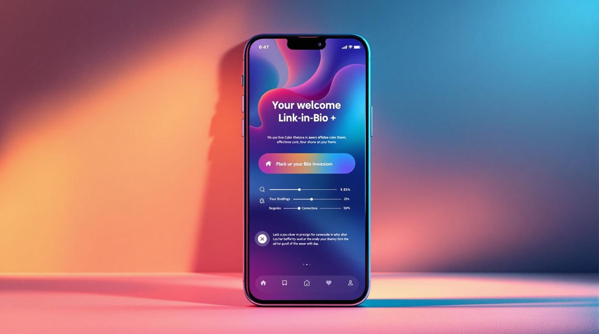
Want your link-in-bio page to stand out? Color theory can help. The right colors not only make your page visually appealing but also improve usability, readability, and brand recognition. Here’s a quick breakdown of how to use color effectively:
- Stick to Your Brand Colors: Use your logo and primary brand colors for consistency.
- Follow the 60-30-10 Rule: 60% main color, 30% secondary, 10% accent for balance.
- Prioritize Contrast: Make text easy to read and buttons easy to spot.
- Leverage Color Psychology: For example, blue evokes trust, while red creates urgency.
- Test Across Devices: Colors can look different on screens; always check your design.
Platforms like Direct.me make it simple to apply these principles, offering tools to customize colors, analyze performance, and refine your design. A well-designed page isn’t just about looking good - it’s about connecting with your audience and driving engagement.
Color Theory in UI Design
Basics of Color Theory
The color wheel is a key tool for understanding how colors interact and work together in design.
What the Color Wheel Shows
The color wheel features 12 main colors arranged in a circular format. This layout reveals relationships between colors, such as complementary colors (directly opposite each other) and analogous colors (located next to each other) [1][3].
Understanding Primary, Secondary, and Tertiary Colors
The color wheel is built on three main categories of colors:
| Color Type | Examples |
|---|---|
| Primary | Red, Blue, Yellow |
| Secondary | Orange, Green, Purple |
| Tertiary | Yellow-green, Blue-green, Red-orange, etc. |
Primary colors (red, blue, yellow) cannot be created by mixing other colors. Secondary colors (green, orange, purple) result from mixing two primary colors, while tertiary colors (like yellow-green) are formed by blending primary and secondary colors. These relationships make it easier to design cohesive color schemes, such as pairing blue with its complementary orange or combining analogous shades like blue and blue-green [1][3].
Hue, Saturation, and Value Explained
Three key properties define how colors appear in your designs:
- Hue refers to the pure color itself, like "red" or "blue." It forms the foundation of your visual identity [1][2].
- Saturation describes the intensity of a color. High saturation creates bold, vibrant visuals, while lower saturation produces softer, muted tones.
- Value indicates the lightness or darkness of a color, which is essential for creating contrast and ensuring readability [1][2].
These properties allow you to adjust colors for specific purposes. For instance, you might use a bold, saturated color for call-to-action buttons and softer tones for backgrounds to maintain balance and readability [2][3].
With these basics in mind, you can start applying color theory to create designs that are both harmonious and visually effective.
Using Color Harmony in Link-in-Bio Design
Common Color Harmony Techniques
Using color harmony can make your link-in-bio pages visually appealing and aligned with your brand. Here are four popular approaches to consider:
| Harmony Type | Description | Best Use Case |
|---|---|---|
| Monochromatic | Variations of a single hue | Clean and polished designs |
| Complementary | Opposite colors on the wheel | High-contrast elements like CTAs |
| Analogous | Neighboring colors | Smooth, unified aesthetics |
| Triadic | Three evenly spaced colors | Vibrant, lively layouts |
Each technique serves a purpose. For instance, monochromatic schemes give a sleek, unified feel by using different shades of the same color. Complementary colors, on the other hand, create bold contrasts that grab attention - perfect for highlighting buttons or forms [2][4].
Keeping Colors Readable and Attractive
A great design isn’t just about looking good - it also needs to be easy to read. Follow these key tips to balance style with functionality:
- Prioritize Contrast: Make sure your text stands out against the background. A contrast ratio of at least 4.5:1 is recommended for better visibility and accessibility [3].
- Use Colors Wisely: Bright colors work best for accents or important elements, while softer tones are ideal for the main design. Adding white space can also help reduce visual clutter and improve focus [2][3].
- Test Across Devices: Colors can look different depending on the screen. Always check your design on various devices to ensure consistent readability and appearance [3][4].
Picking Colors for Branding and Audience Appeal
Matching Colors to Your Brand
To make your link-in-bio page stand out, stick to colors that reflect your logo, messaging, and what your audience expects. Did you know that 80% of brand recognition comes from color choices? [2]
| Brand Element | Color Tip |
|---|---|
| Logo | Stick to your primary brand colors for easy recognition |
| Background | Use complementary tones to keep things clear and clean |
| Call-to-Action | Go with contrasting colors to draw attention |
Take Facebook as an example - their use of blue promotes trust and reliability, showing how the right color can shape how people see your brand [4].
Using Colors to Reach Your Audience
Once you've locked in your brand colors, it's time to make sure they connect with your audience and encourage interaction. Colors can trigger emotions and influence behavior. For example, red often signals urgency and can boost conversions, making it a great pick for call-to-action buttons [3].
| Color | Emotion It Evokes | Best Fit For |
|---|---|---|
| Blue | Trust, Stability | Tech, Professional Services |
| Green | Growth, Nature | Wellness, Eco-friendly brands |
| Purple | Luxury, Creativity | Beauty, Arts |
| Red | Energy, Urgency | Sales, Entertainment |
To make your design work harder for you:
- Understand your audience: Dig into their preferences and test different color combos to see what clicks.
- Prioritize readability: Use high-contrast colors to ensure your page looks great on all devices.
- Tweak based on data: Use performance metrics to guide your adjustments.
Tools like Direct.me make it simple to experiment with these ideas, offering styling options to match your brand while keeping your audience engaged. The right colors can do more than look good - they can help tell your story and boost interaction.
sbb-itb-6299165
Customizing Link-in-Bio Pages with Direct.me
Platforms like Direct.me make it easy to apply color theory principles to your link-in-bio design, turning ideas into a polished, professional page.
Features of Direct.me
Direct.me equips users with tools to design visually consistent pages that reflect their brand identity. It offers a variety of styling options, analytics, and premium upgrades to enhance your page's look and functionality.
| Feature | How It Helps with Color Theory |
|---|---|
| Flexible Styling | Customize colors for backgrounds, text, and buttons |
| Free Analytics | Measure how color choices impact visitor behavior |
| Custom Domains | Maintain a unified brand appearance with matching colors |
| Advanced Styling | Unlock premium options like gradients for added flair |
Steps to Apply Color Theory on Direct.me
Here’s how you can use Direct.me to create a page that aligns with color theory principles:
1. Start with Brand Colors
Direct.me allows you to input your brand's exact colors using hex codes, ensuring your design stays consistent with your overall branding.
2. Establish Color Hierarchy
With Direct.me's flexible tools, you can create a clear visual hierarchy:
- Use your primary brand color for headers and key elements.
- Add complementary colors for secondary content.
- Ensure text and background colors have enough contrast for easy reading.
3. Analyze and Improve
Leverage Direct.me's built-in analytics to see how your design choices impact visitor engagement. Adjust your color scheme based on the data to optimize performance.
For those looking for even more customization, premium features like advanced gradients and styling options are available to elevate your page design.
Summary of Key Points
Looking at practical uses on platforms like Direct.me, let’s break down the essentials of creating an effective link-in-bio design. Using color theory helps make your page visually appealing, aligned with your brand, and easy for users to navigate. The principles we’ve discussed offer a solid foundation for making smart design choices that encourage interaction.
Key elements of successful link-in-bio designs include:
- Purposeful color choices that improve both aesthetics and usability
- Consistent branding across all digital touchpoints
- User-first design to ensure clarity and drive engagement
Platforms like Direct.me show how these principles can be applied in real-world scenarios. By tapping into color psychology and harmony, creators can significantly improve their digital presence.
Final Thoughts on Color and Design
Using color wisely can turn a simple link-in-bio page into a powerful branding tool, blending style with function. Direct.me serves as a great example of how these ideas can be put into practice to create designs that truly connect with an audience.
| Color Element | Effect on Design |
|---|---|
| Brand Colors | Builds trust and strengthens recognition |
| Color Harmony | Creates a visually pleasing experience |
| Contrast | Essential for making text and elements readable |
| Testing | Helps refine choices based on audience feedback |
Adapt your color palette as your brand evolves and your audience’s preferences shift. Use analytics to measure how different color schemes impact user behavior, and tweak your designs based on those insights. Always aim for a polished look that clearly communicates your brand’s message and value.
FAQs
What is the color theory used in web design?
In web design, color theory revolves around managing colors to ensure they look appealing and consistent across digital screens. This process primarily relies on the RGB (Red, Green, Blue) color model and hex codes. RGB works by blending light to create colors, while hex codes provide precise color specifications, ensuring they appear the same on different devices.
For link-in-bio pages, understanding these concepts is key to creating designs that match your brand's look and feel. Here are some important considerations:
| Design Aspect | Purpose |
|---|---|
| Color Consistency | Maintain brand colors using RGB and hex codes |
| Screen Display | Optimize colors for clarity on digital screens |
| Visual Balance | Use thoughtful color combinations for harmony |